This project is a new method for manipulating a collection of multifaceted data in a single visual environment where every drag of the mouse invites fresh analysis. This tool is something different from pie charts and bar graphs, static graphics that argue specific points. This tool provides an opportunity to interface with data for discovery and rediscovery of information and ideas. Please feel free to view the demo and use the device.
The data brought together for use in this version of the tool comes largely from the 2005 CIA World Factbook, but there are a variety of qualitative analyses expressed in the visualizations as well. These qualitative analyses come from a variety of sources: the U.S. Joint Forces Command Report on Iraq issued in February of this year, the summary of that report issued by the Council on Foreign Relations, and Population Action International\'s Report on Security Demographics, which addresses population and civil conflict.
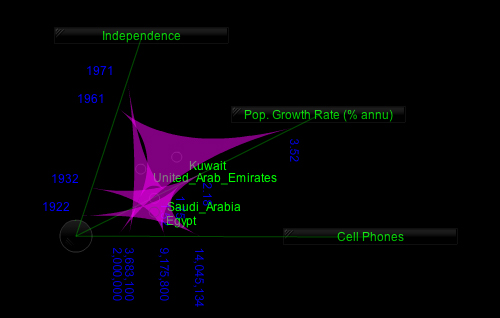
Quantitative data is stored topic by topic and a few qualitative analyses are coded to express themselves animation. Users begin by clicking a topic from the list on the right and dragging it toward the center of the screen. The countries then arrange themselves between that topic and an origin, the dark circle you see alone on the screen at the beginning. Each country aligns itself along the new axis according to its statistical value corresponding to that topic. For example, if the topic is population and the country has the highest population of all countries on the screen, that country will align itself closest to the topic and the actual data value will appear on the screen.
As new topics are dragged into the active space and moved around, and new visuals created, the user has an opportunity to determine whether what they see advances their argument or introduces a new idea. Note: the origin is also movable. Copyright 2006